PECK
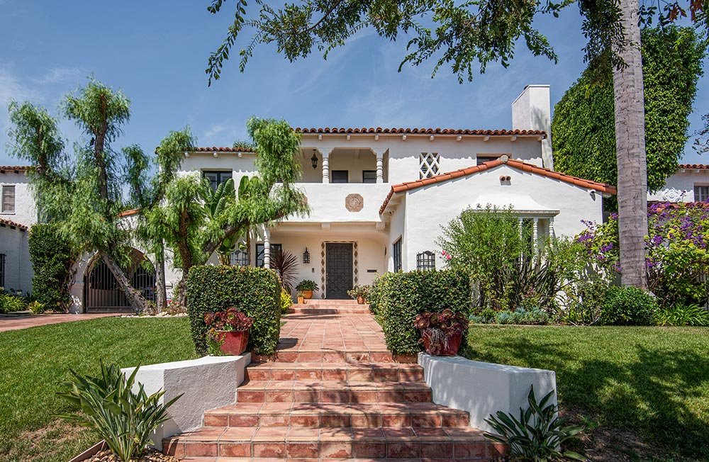
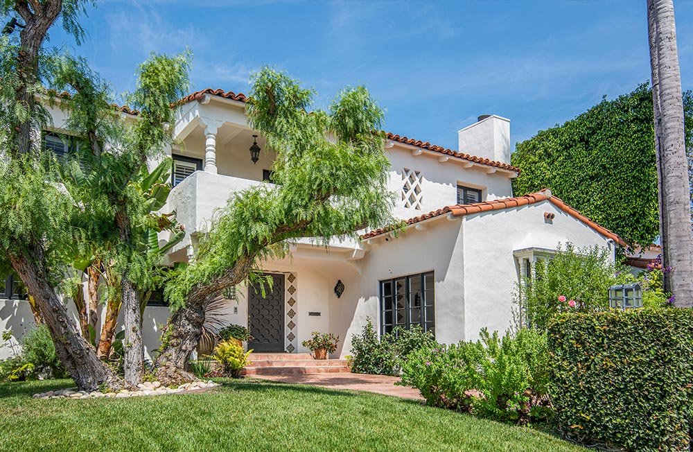
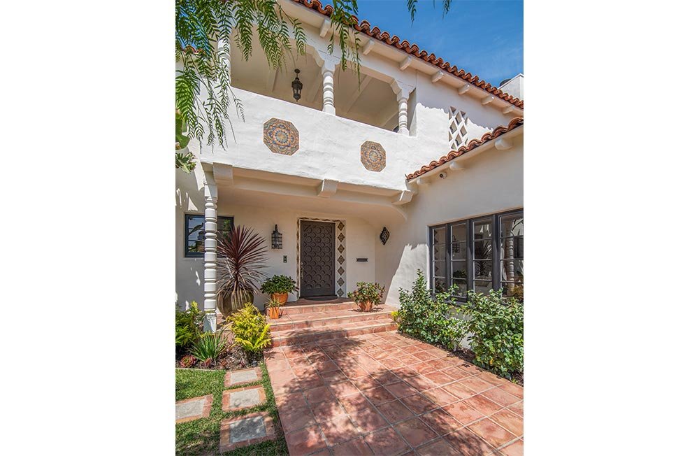
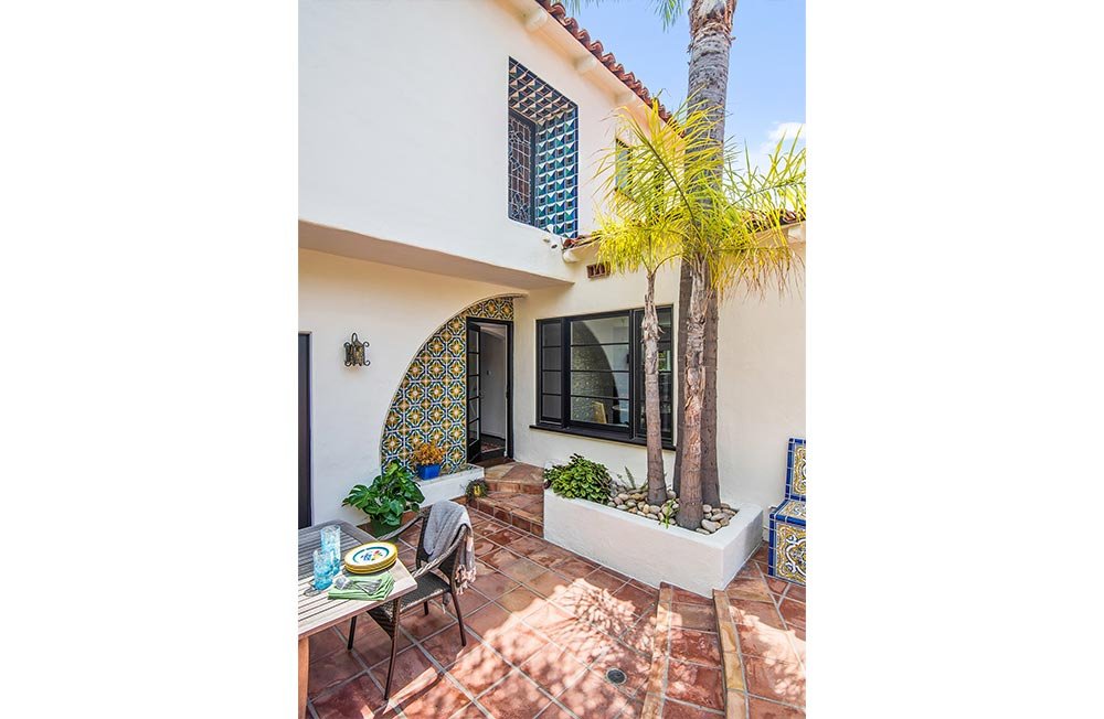
Set among the urban tapestry of the Beverly Hills flats, this 1929 Spanish Revival home features stunning original tile and turned-wood details. The clients – a professional couple with two high-school aged daughters – had been putting off a number of upgrades to the kitchen and bathrooms, and finally resolved to undertake a fairly extensive renovation.
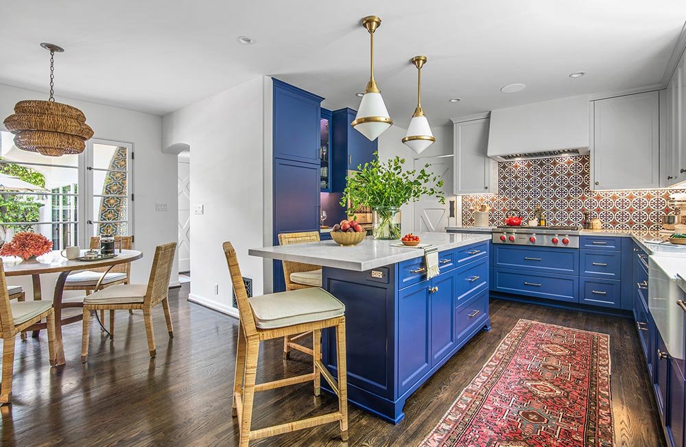
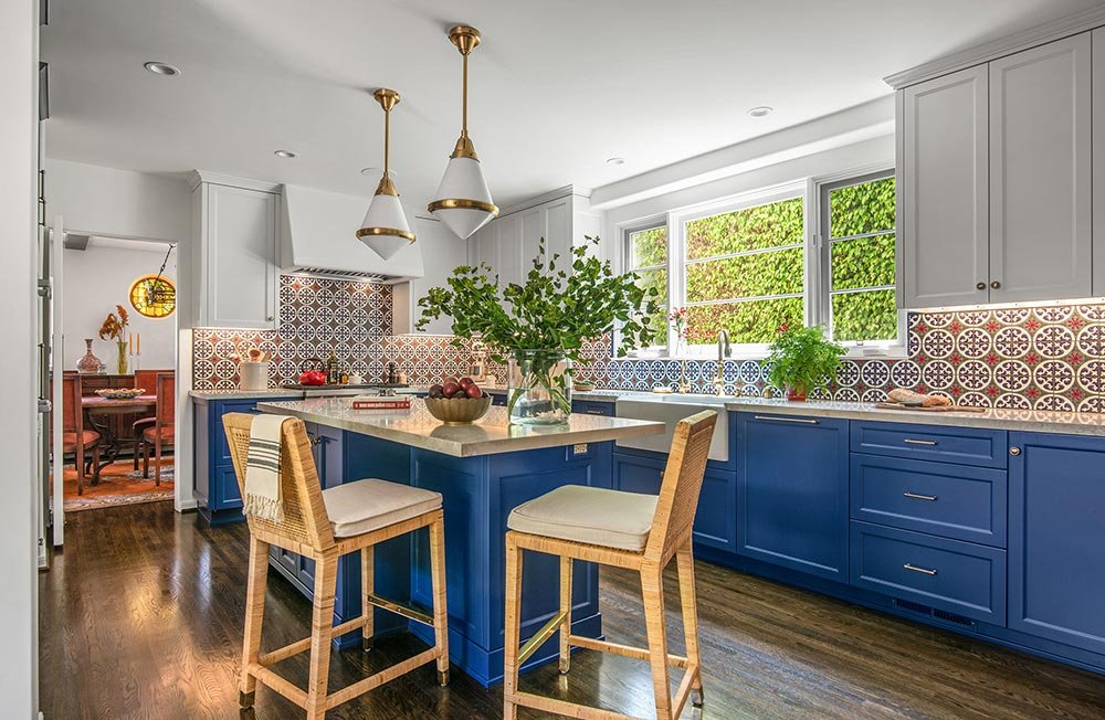
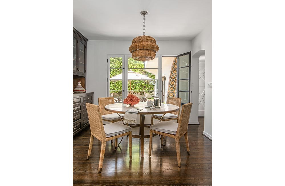
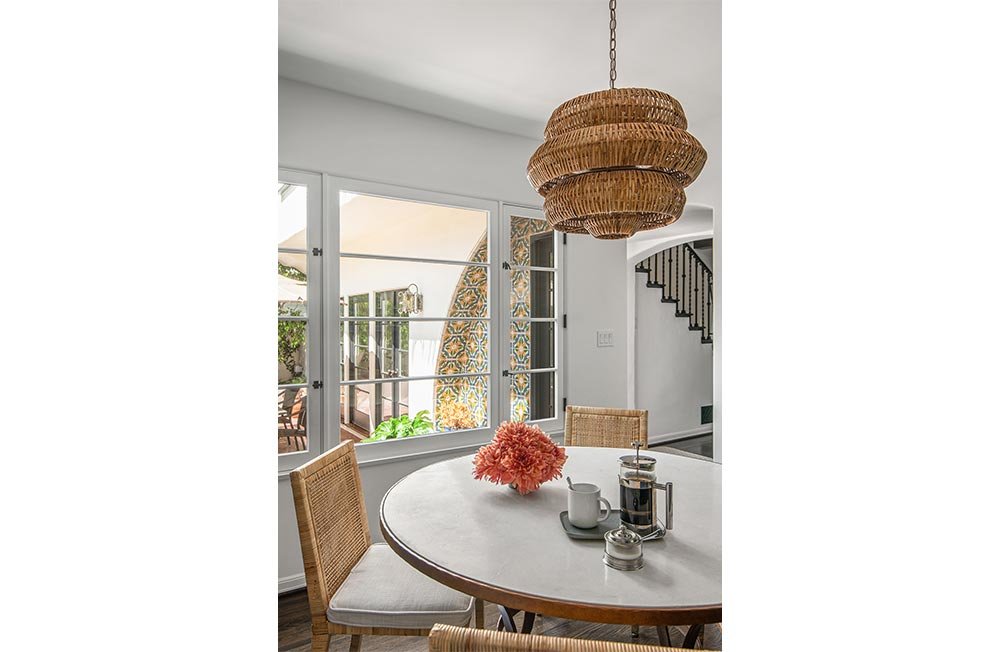
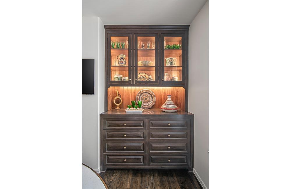
The focus of the remodel was the home’s kitchen and bathrooms. The kitchen, while quite generous in size, lacked easy connection to the rest of the home, and to the rear yard/pool area; it was principally accessible only via a cramped arched vestibule off the stairwell, and through the adjacent formal dining room. A crafty reorganizing of the clumsily arranged warren of spaces between the kitchen and the rear patio made for an elegant solution. The powder room, which was the main culprit in this ungainly mess, was neatly relocated to a space off the entry stairwell formerly occupied by a coat closet (and a spatial void that was discovered during demolition). This allowed for extending the kitchen northwards, creating an L-shaped space that now allows room for a breakfast table; a generous new set of windows provides visual connection to the rear patio, and floods the breakfast nook with natural light. In addition, this new space allowed for a custom-made built-in walnut hutch, providing the perfect opportunity to prominently display the clients’ cherished collection of hand-painted ceramics and pottery that they’ve gathered during extensive world-wide travels.
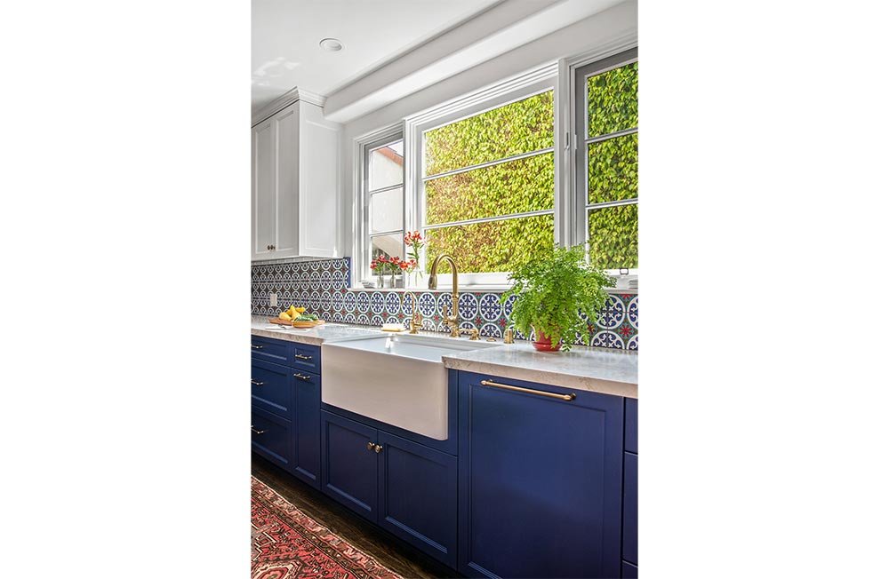
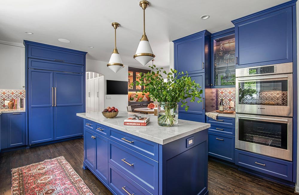
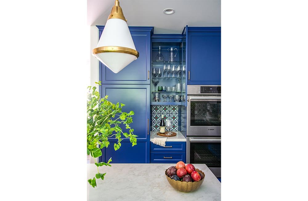
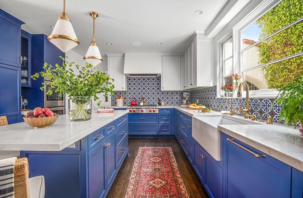
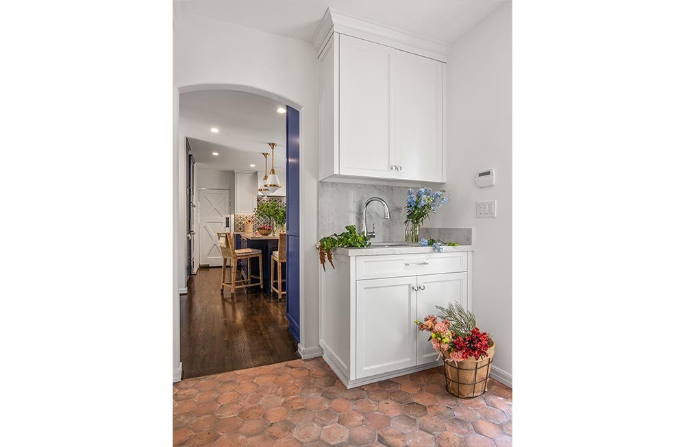
Set against a vibrant backdrop of custom-hued glazed Spanish tiles, the bright blue cabinetry accommodates the varied needs and interests of the family with a variety of “stations.” The husband’s devotion to mixology is manifested in a bar niche, tucked neatly into a bank of wall cabinets. Weekly challah breadmaking finds its place at one end of the slender quartz-topped island, with convenient seating for lookers-on at the opposite end; nearby double wall ovens facilitate this ritual, as well. The laundry area, formerly located within the kitchen space, now has its own vestibule, which multitasks as a mudroom, utility room and, with the addition of a sink, flower arranging station. To optimize storage, two former windows at the south kitchen wall were replaced with a single, slightly larger one, making for a symmetrically arranged organization with a porcelain farmhouse sink at its center, flanked by matching upper cabinets.
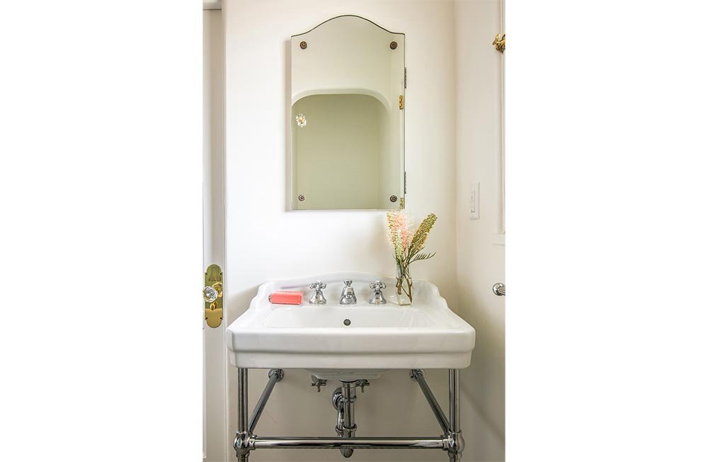
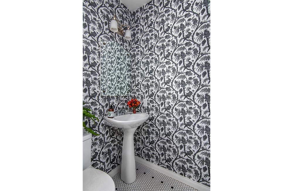
The existing home office and bath, adjacent to the laundry room, formerly served as the maid’s quarters. Since the use of this room is now set up for two desk stations and is truly an in-home office, the tub was never used. Turning this full bath into a second powder room meant that the space formerly occupied by the tub could now be given over to the built-in hutch space in the breakfast nook. The small white hex floor tiles with the black dot border make this bathroom feel original to the house. The wallpaper, selected by the client, expands the small space with its overall design. Sink, mirror and light fixtures were reused.
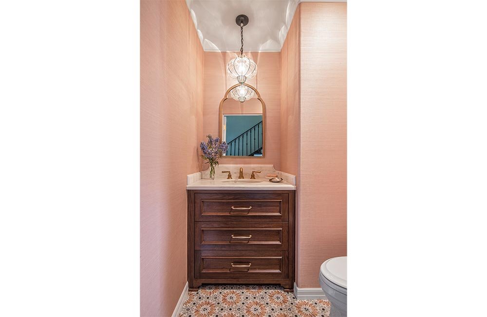
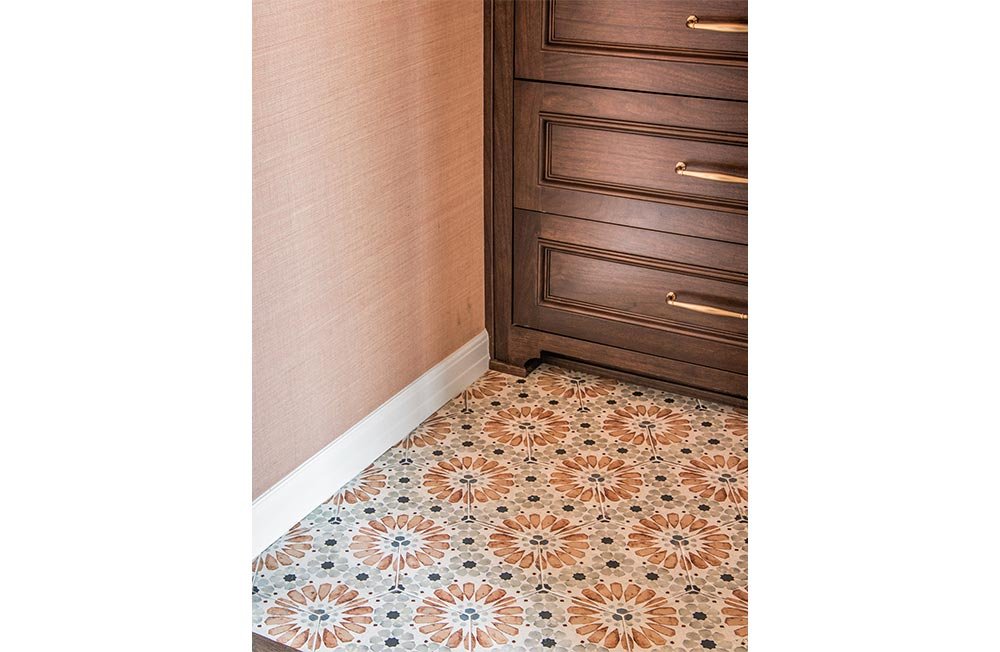
In the new Powder Room, the walnut cabinet with decorative toe kick, and drawer fronts with applied picture molding, lend the piece the look of a freestanding chest. The marble top and backsplash feature decorative details, while the plaster cove and bead detail used at the ceiling are in keeping with home’s Spanish style details, and provide a place for the blush grasscloth wallpaper to terminate. The rooms’ door was custom-made to match the home’s other original doors with their carved detailing. Porcelain floor tiles and satin bronze faucets round out the look.
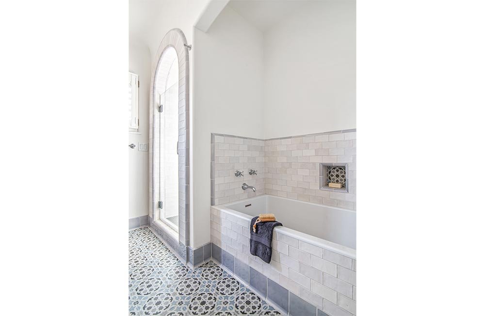
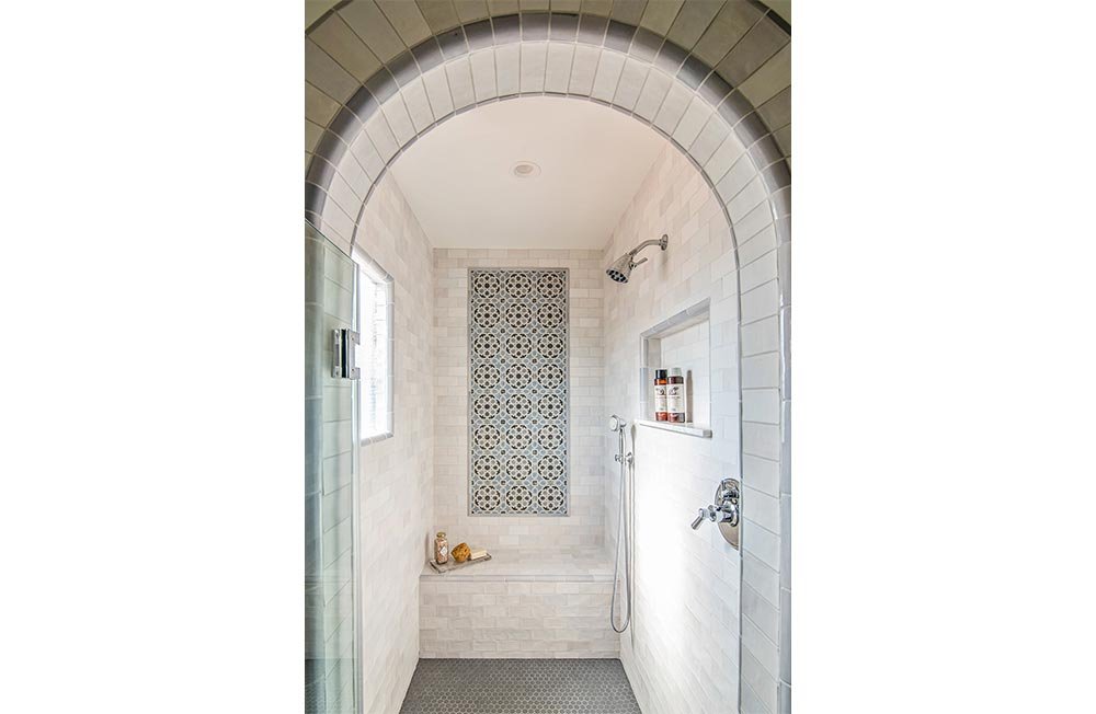
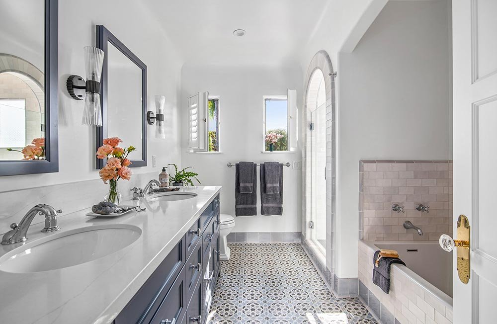
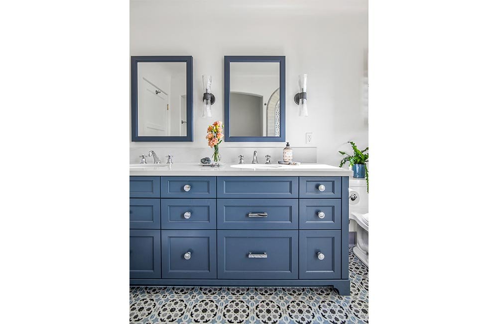
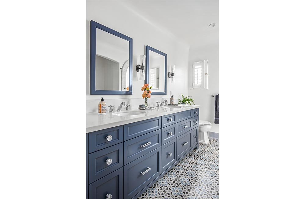
Previously accessed awkwardly through the dressing area, the Primary Bathroom’s new layout, achieved through a rearranging of the entry and plumbing fixtures, allows for an expanded, more luxurious space. Features include a double-sink vanity, a large-walk-in shower, and an arched tub niche. The coved ceiling was retained, and the shower and tub arches were built to match original details. The colors in the Moroccan style ceramic floor tile served as inspiration for the overall palette.
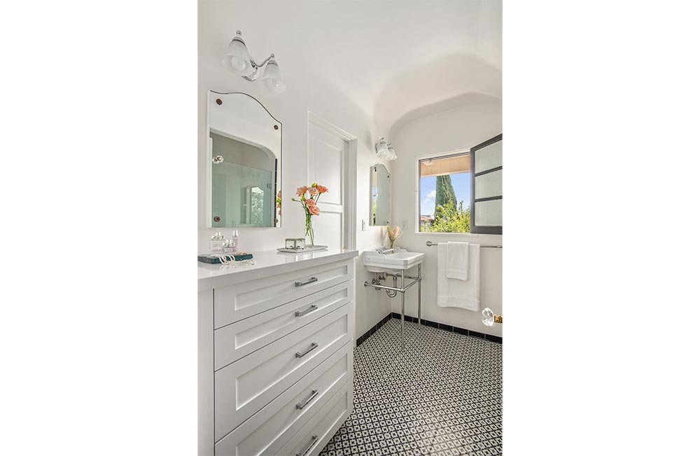
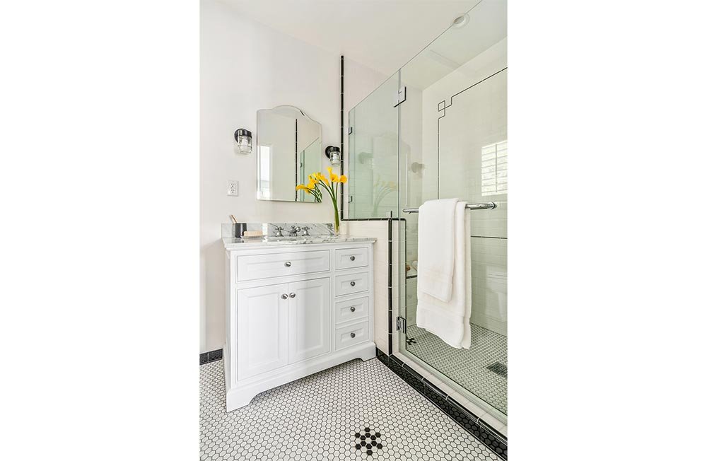
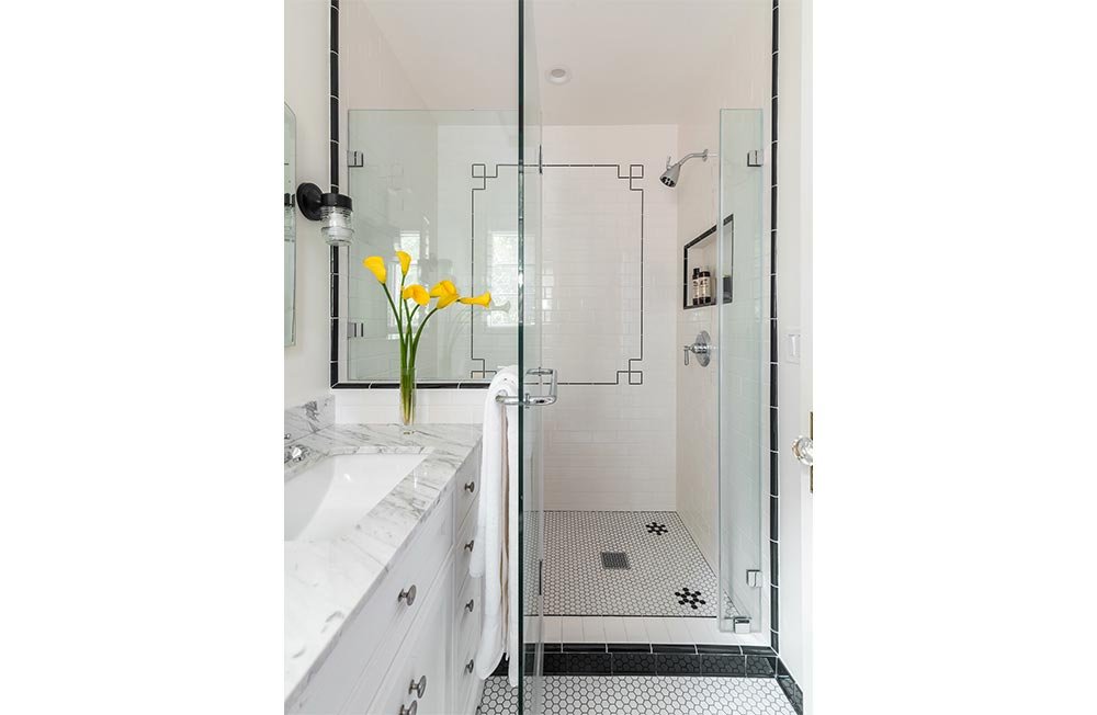
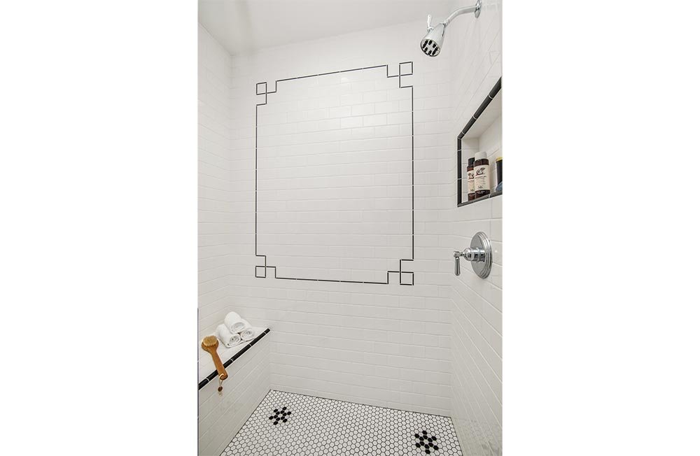
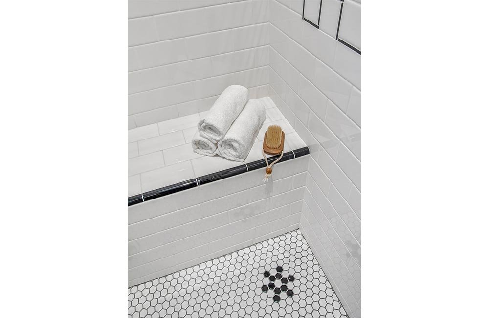
Upstairs, a single hallway bathroom had been shared by both daughters. In order to provide each daughter with their own bathroom, a second bath was added, by reconfiguring poorly utilized closet space. The new bath, detailed in simple black and white, features a walk-in shower with bench, accented with decorative detailing in black tilework.
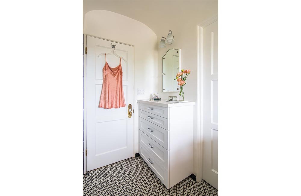
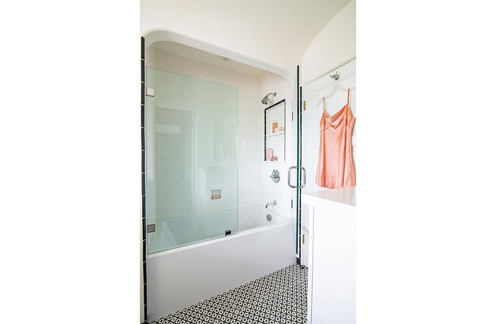
The previously shared hallway bath was reconfigured to optimize the space. The toilet was relocated in order to create a much-needed custom built-in storage cabinet, the original cove ceiling was retained, and the arch over the tub was raised for a new larger tub/shower combination. A simple scheme of black and white tilework, consistent with the look of the other new bath, is accentuated by the fretwork design of the porcelain floor tiles.
All existing hardwood floors were refinished, and a fresh coat of paint applied to the entire house.

