Connecting each of our projects is a series of shared design values - a dialogue and exploration found between light and landscape
Select Residential Projects
ALTADENA
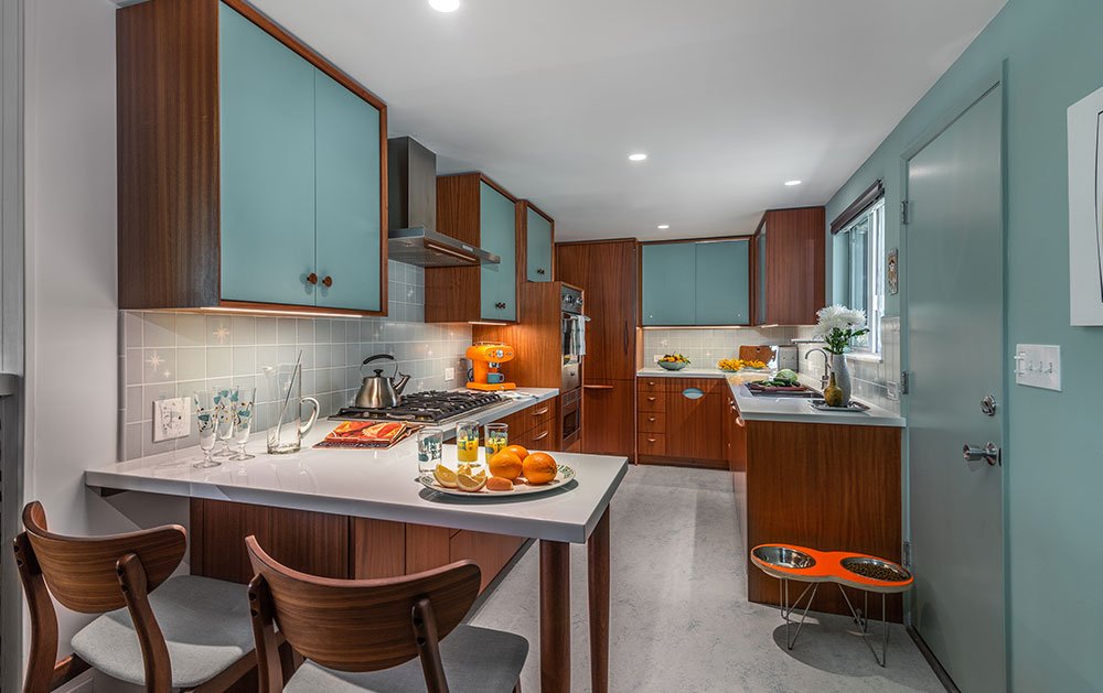
Vibrantly Updated Mid-Century Modern
This mid-century modern gem, with sweeping views of the San Gabriel Mountains, was built in 1960 by the female Swiss artist, Gisela Meier, a disciple of famed furniture and industrial designer, Kem Weber. Meier thoughtfully built the house on a very challenging long and narrow site with a 20’ slope, without altering the natural topography.
LOS FELIZ
CASA DOMINGO REMODEL
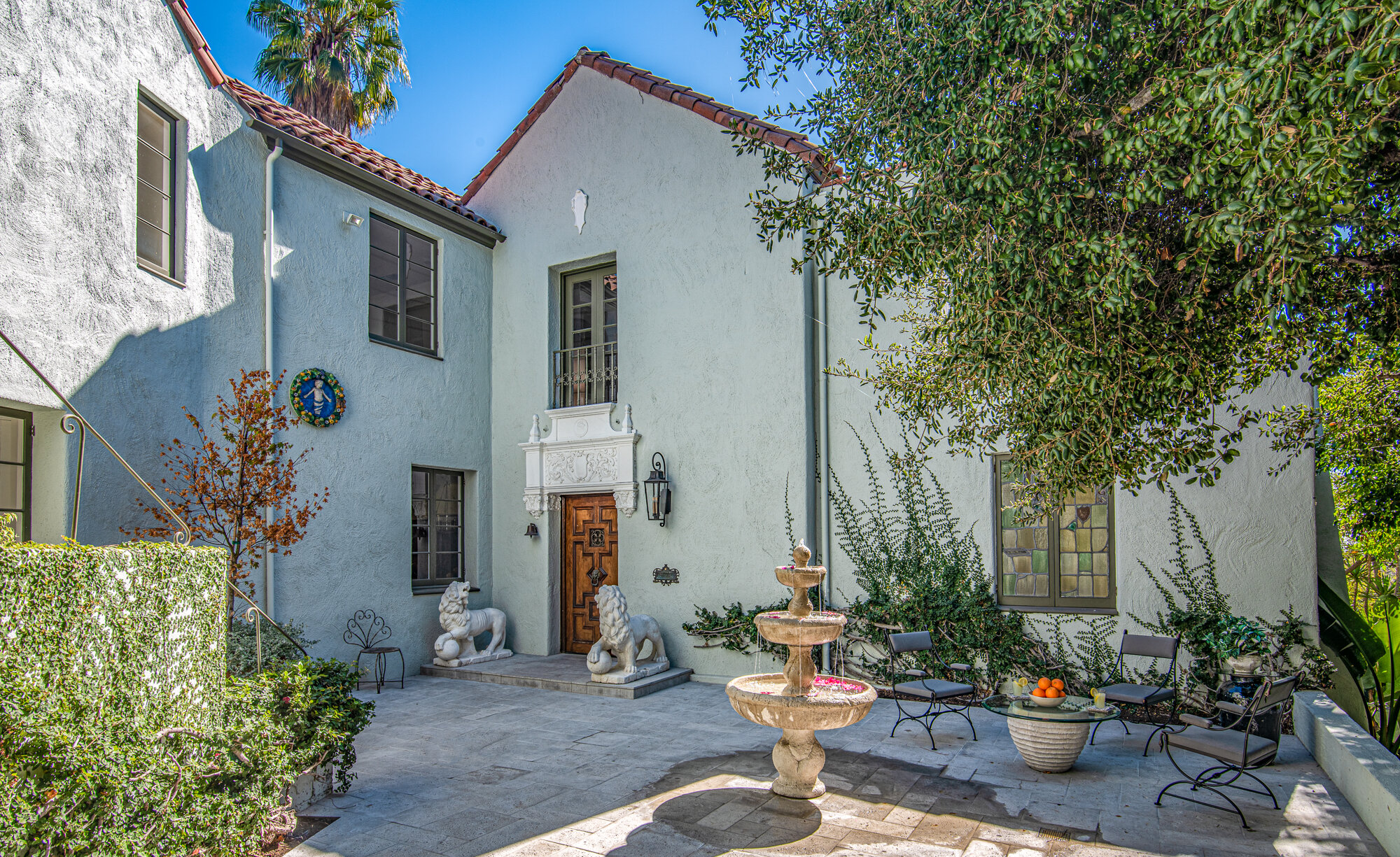
This 1927 Spanish Mediterranean Revival house was completely remodeled while preserving all of its extraordinary architectural details, such as original Malibu tiles and original paint and tile murals. The original plaster in the grand two-story foyer was brought back to life by the careful removal of layers of paint. A hand forged iron gate was custom-made for the top of the gracefully curved stair railing as if it had always been there.
MARIOTA
TOLUCA LAKE REMODEL
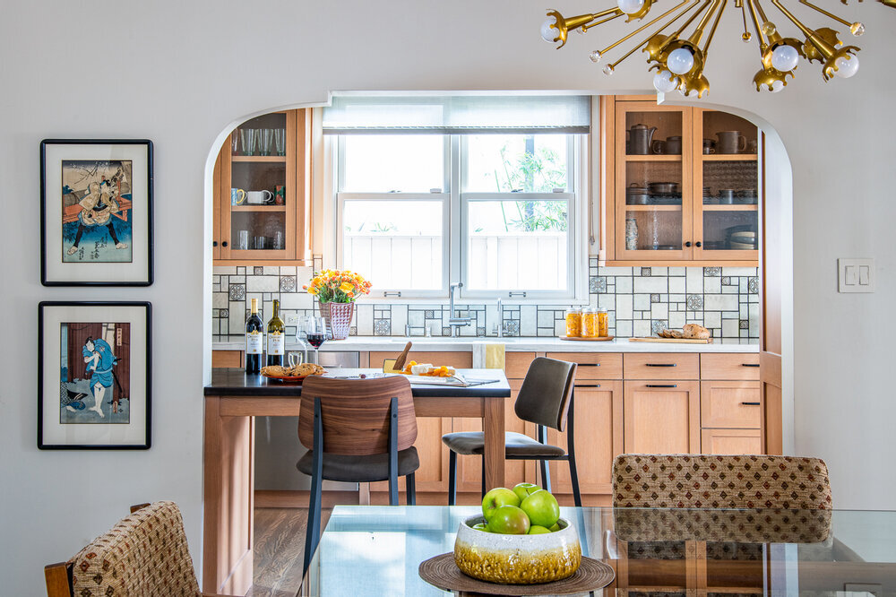
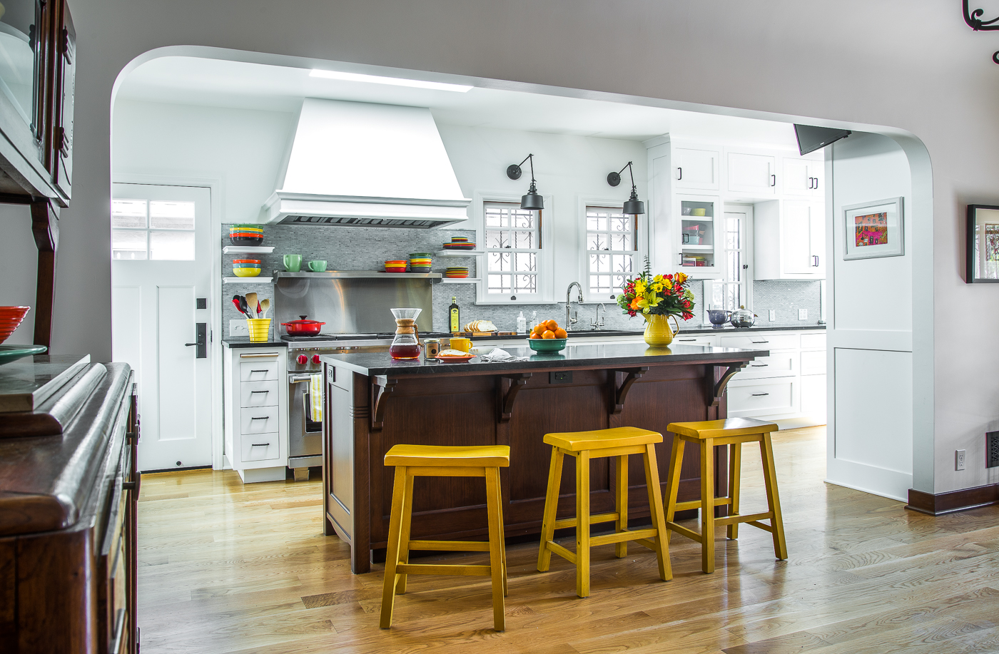
Before the current homeowner took possession of the property, this house was remodeled from a single-story Spanish Revival house to a two-story contemporary Craftsman house. Although there was plenty of square footage, the layout and flow through the various rooms on the first floor was maze-like and lacked cohesion. To solve the bottleneck issue during family gatherings, the kitchen and dining room walls were removed, and a central bathroom was relocated to the rear of the house, thereby opening up the entire first floor. The dining room, opened on all sides by 3 new arched openings that match the existing living room arch, now serves as a central hub of the home.
LAS PALMAS
HISTORIC HANCOCK PARK REMODEL
This classic English Revival home from the 1920’s needed desperately to be reimagined for the way a family lives today. Open floor plans evolved for a reason. We want to move through the spaces in our house with less obstructions. So the challenge, and the risk, when redesigning a historic home, is to update the function and flow while maintaining and enhancing the period character.
La Loma
Pasadena Showcase House
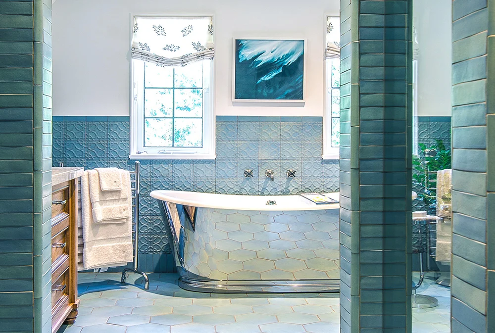
This 1916 English Tudor Revival style mansion was selected for the 2017 Pasadena Showcase House of Design. The house was designed by architecture firm of Marston & Van Pelt for actor Samuel Hinds. Home Front Build completely redesigned the Master Suite area using restful blues and neutrals to create “Seaside Escape”, a tranquil haven from the demands of modern life. The bathroom, sitting and closet areas were completely rearranged to provide necessary closet and bathroom space for today’s lifestyle.
Hillsboro
Beverlywood Remodel
This traditional house had suffered a series of ill-planned additions over time. Each addition was done to satisfy a pressing need, an additional bedroom, a second bath, but none of the additions ever acknowledged that the house was now a larger home. The resulting three-bedroom, two-bath layout was confusing so the main design goal was to reconceive the home without adding more square footage and make the house function more cohesively.
POINT VIEW
SPANISH REVIVAL ADDITION AND REMODEL
This charming 1926 house had a typical Spanish Revival layout with formal areas in the front and the more private/bedroom areas closed off to the rear. Since kitchens play such an important role in any home these days, the wall dividing the kitchen and dining room was replaced with a large arched opening, thereby incorporating the kitchen into the overall living space. The kitchen area was further expanded by integrating the old breakfast nook into the space. And to tie together the newly reconfigured rooms, the island designed as a piece of furniture, using the same material and detailing as the antique dining room sideboard the client had acquired in Paris decades ago.
JAMESON
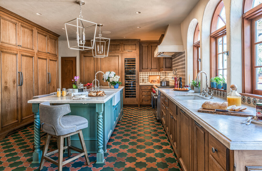
SPANISH-STYLE KITCHEN REMODEL
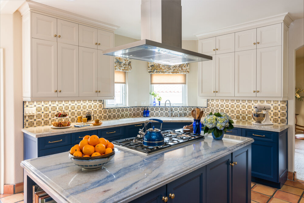
This project is an example of the stunning transformation of a kitchen and breakfast nook without adding square footage, moving walls or windows. The kitchen was completely updated with new custom cabinetry full of specialty storage ideas, quartzite counter tops, and new fixtures and appliances. The beautiful backsplash tile picks up on the Spanish flavor of the house architecture. All materials were chosen to coordinate with existing Saltillo pavers that run throughout the first floor of the house.
BONVUE
HOLLYWOOD HILLS ELEGANCE
This Hollywood Hills residence, full of old-world charm, lives up to the street name, bon vue (French for “good view”), offering the most spectacular views of Los Angeles. As with most homes built in the 1920s, the spaces were isolated from one another, the uses segmented. Guests were entertained in the living room, then served in the dining room from the isolated kitchen, finally recessing to a den for cigars and drinks - never stepping outside, only enjoying the vistas from inside. However, today we live in a house differently. We flow through the kitchen to the living spaces, inside to out, entertaining, relaxing with a book or media. The simple fact is that if this house were designed today, the kitchen would be prioritized to the take maximal advantage of the view.
PCH
Situated at the top of the Malibu Bluff, with sweeping views of the Pacific Ocean, this Mediterranean style home was originally constructed in 1999. In order to take better advantage of its stunning location, and to upgrade the architectural finishes to a level more commensurate with a home of significance, a complete remodel was undertaken. Customized touches can be found throughout, including the kitchen’s impressive hand-troweled plaster hood, constructed with structural beams of weathered antique oak. Custom built-in cabinetry provides elegant storage in nearly every room, and a comprehensive smart home system allows for easy and full control over all aspects of the home’s functionality – from climate control to lighting, security to entertainment.
Edgemont
Los Feliz Spanish Colonial Remodel & Addition
The Hollywood Hills location and its zoning code restrictions only allowed a 300 square feet addition to this 1920’s Spanish Colonial Revival home. With creative reorganization of the spaces, and opening up the house to the outdoors, this previously weekend getaway house is now a family house.
A complete master suite was created using the original maid’s quarters and the new addition over the garage. A new powder room was added in a seldom used side entry vestibule, and finished simply and elegantly in a unique red clay floor design and hand-applied integral color plaster.
Abbey
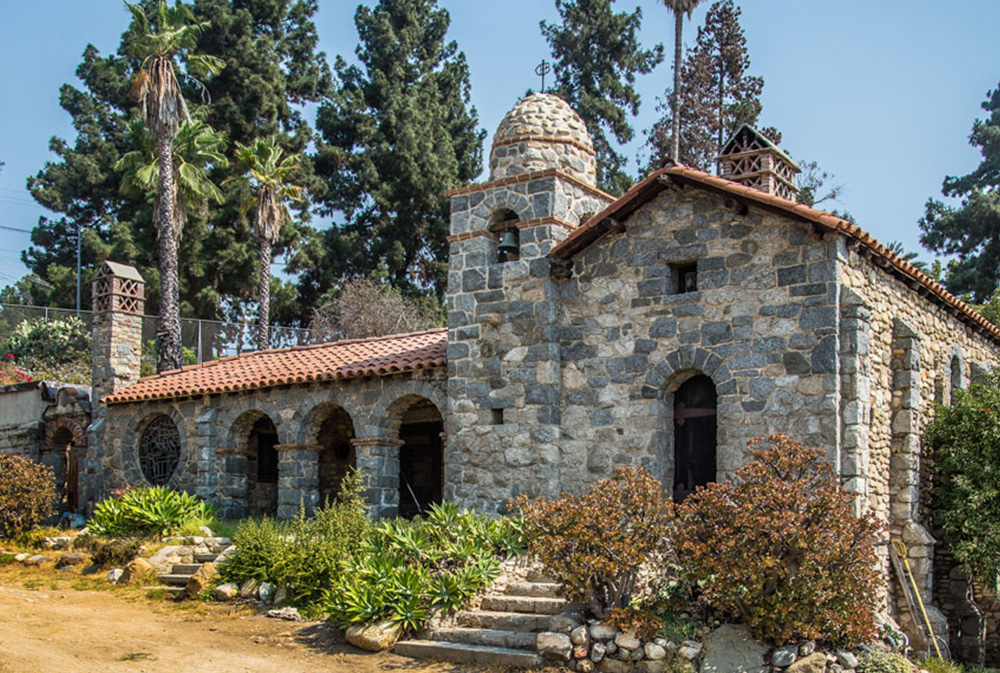
The Abbey San Encino was a utopian artisan community planned for the Arroyo Seco area of Los Angeles during the Craftsman period. Visionary designer/typographer, Clyde Brown, conceived the central structure as a European abbey complete with bell tower.
ORANGE GROVE
Beginning in the 1920’s and ‘30’s, residential tile design exploded with color. During this period, the sanitary, utilitarian practicality of pure white tile in the craftsman period was set aside for color and pattern.
Balmer
Silverlake Spanish Colonial Revival Addition & Remodel/ ”This Old House” Project
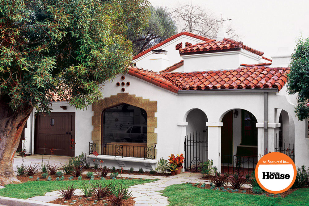
This remodel and addition to a 1933 Spanish Colonial Revival house was the first project the renowned PBS show “This Old House” ever filmed in Los Angeles.
The existing house was a single story 1500 square foot two-bedroom, one-bath house. Quaint but too tight for a growing young family with two kids. Being located in the highly desirable historic hillside area of Silverlake, buying a new larger home was a less desirable option.
Aladdin
Because of the stunning panoramic views of the city the client wanted to move to an open floor plan combining the living, dining and kitchen areas in one room. Open floor plans are always problematic because the different functions that a kitchen performs does require differentiation from the more formal public rooms. A kitchen, in the end, is a functional space for cooking. So the challenge in an open floor plan is to buffer this utility space with a more finished facade to the living and dining rooms.
Euclid
Westside Addition and Remodel of a Spanish Colonial Remodel
This late 1920s single story 1500 square foot Spanish Colonial house had a typical floor plan of the period, public rooms up front and bedrooms behind, no access to the rear yard. In order to open the home to the newly landscaped rear yard a second floor was added moving three bedrooms and two baths upstairs creating a larger 3000 square foot home with 4 bedrooms and 3 ½ baths.
The now grander floor plan accommodated a central stair well with turret above filling the central core of the house with light and ornate period details such as the Malibu tile risers and ornate hand forged metal railing.
Hiawatha
San Fernando Valley Historic Ranch Remodel
This residence was once part of a larger Ranch built in the 50’s in an area of the San Fernando Valley which was popular with Hollywood luminaries such as Roy Rogers, Dale Evens, Desi Arnaz & Lucille Ball. The goal of the remodel was to update the kitchen and integrate it into the living area, adding modern amenities while creating a space that was clearly synonymous with the original ranch style.
Hobart
Sugar Hill Craftsman Remodel & Addition
This grand 5,200 square foot Los Angeles Craftsman home, complete with third story ballroom, built in 1905 was in a state of neglect when the owners purchased it. The neighborhood in which the home was located was once the rich suburbs. Over time a growing and changing urban core enveloped the once exclusive enclave and the neighborhood fell into disrepair. In addition to the interior remodel, the entire house was upgraded with removing the original brick foundation, new roofing to correct water intrusion, removing decades-old paint, and replacing all original electrical, plumbing and heating systems and adding air conditioning.
Ilona
Rancho Park Spanish Colonial Addition and Remodel
The existing single story residence in the Rancho Park neighborhood had the public rooms in the front and bedrooms and baths in the rear. This cramped 3-bedroom/1-bath house was transformed to 4-bedroom/3-bath house by adding a new second story. The bedrooms and laundry were moved to the second floor which freed up floor space on the first floor to create a through line from the entry to the remodeled rear yard.
Mt. Washington
Mt. Washington Craftsman
An old, vintage ice box and some salvaged v-groove paneling from a nearby tear-down house inspired the remodel of this Craftsman kitchen. Once safely stripped of old toxic paint, there was enough beautiful old growth Douglas fir paneling to clad the wainscoting in both the kitchen and bathroom - with a bit left over for cabinet doors.
Bannockburn
Cheviot Hills Remodel
The existing kitchen was stuck in the dark center of this house on a narrow urban lot. Since the kitchen could not be relocated, the remodel incorporated a turret to allow light and air to flood the room. The kitchen was no longer a utility space for cooking and serving but was now, literally and figuratively, the center of the home and family life.


